we have decided to switch out the office for a guest room. truth be told, it was always more of a dumping ground for things without a home than it was an office anyway. (i think we dubbed it the office since the desktop and printer lived there.) i don't think anyone will miss the office.
but a guest room...now that sounds useful to me. the air bed sprung a leak and so any guests that now stay over bump the boys from their room to aiden's floor. (which they do not mind in the least. they are huge fans of sleeping in "nests".) it's just that the boys have a queen-sized bed that they share and it is really the only logical place to put anyone. but...they have recently become way too squirely to share a bed. and their mattress is shot and needs replacing. and our awesome neighbor recently moved and gave us a double mattress in great condition that we can use in the guest room. (yes a double is a bit small, but snuggle up people, it's not forever.) guest room it is!
since the room is technically the attic and is finished off in some *lovely* wood paneling, i am hoping to make the space feel a bit more open and airy. i have gone through way too many cans of white paint and the albeit-it-tiny room is already feeling more spacious. i am trying to go for a bit of cottage meets beach house.
our room has a window and ceiling slant just like this. i ripped down a small ceiling that someone had put up and so we now have a few small beams like this showing as well.
i have some oil on canvas auction finds i may consider hanging in there similiar to this. i will also need to paint the subfloor and this floor looks like it may be painted as well. trying to decide now if the floor should be white to blur the lines of this super small room, or if i should paint it the same dark blue/green (benjamin moore narraganset green) as the playroom to help ground the space since the ceiling is high in there.
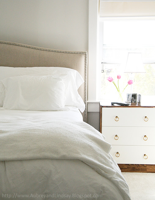
i really like this neutral palette with small touches of black.
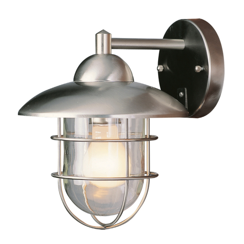
so here's the latest dilemna in the space. we are going as cheapo as possible up there. i found two great light fixtures (at lowe's of all places) that i think will look nice above the door. this is the only place there is wiring for a light and so i need a sconce of some sort for there. both of these are about $25. (sweet, price right?!)
do we go for the barn light inspired sconce in galvanized metal? (which is already cool looking but may look good painted up all glossy)
or the more nautical inspired fisherman's light that speaks to the wall mounted lights next door in the playroom?
 |
playroom lights from pottery barn kids
|
whatever sconce we pick will probably also go outside the door in the hallway to downstairs. (the 70's called and they want their brady bunch looking light back.)
so...what's your vote? which light is your favorite?